Spotify

NEW ADDED FEATURE

Music For Everyone

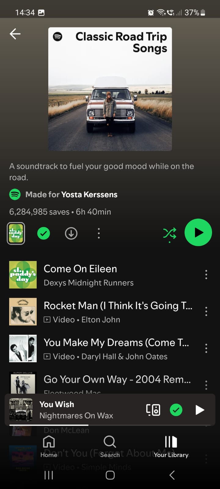
Spotify is a popular music streaming service that provides users with access to a vast library of songs, podcasts, and other audio content. Spotify has grown into one of the world's leading platforms for music and audio entertainment. It combines convenience, variety, social sharing and innovative features that keep users engaged while offering both free and premium options for different user needs. Spotify continues to be a leader in the music streaming market, but like any app, it has areas that could be improved.

Problem

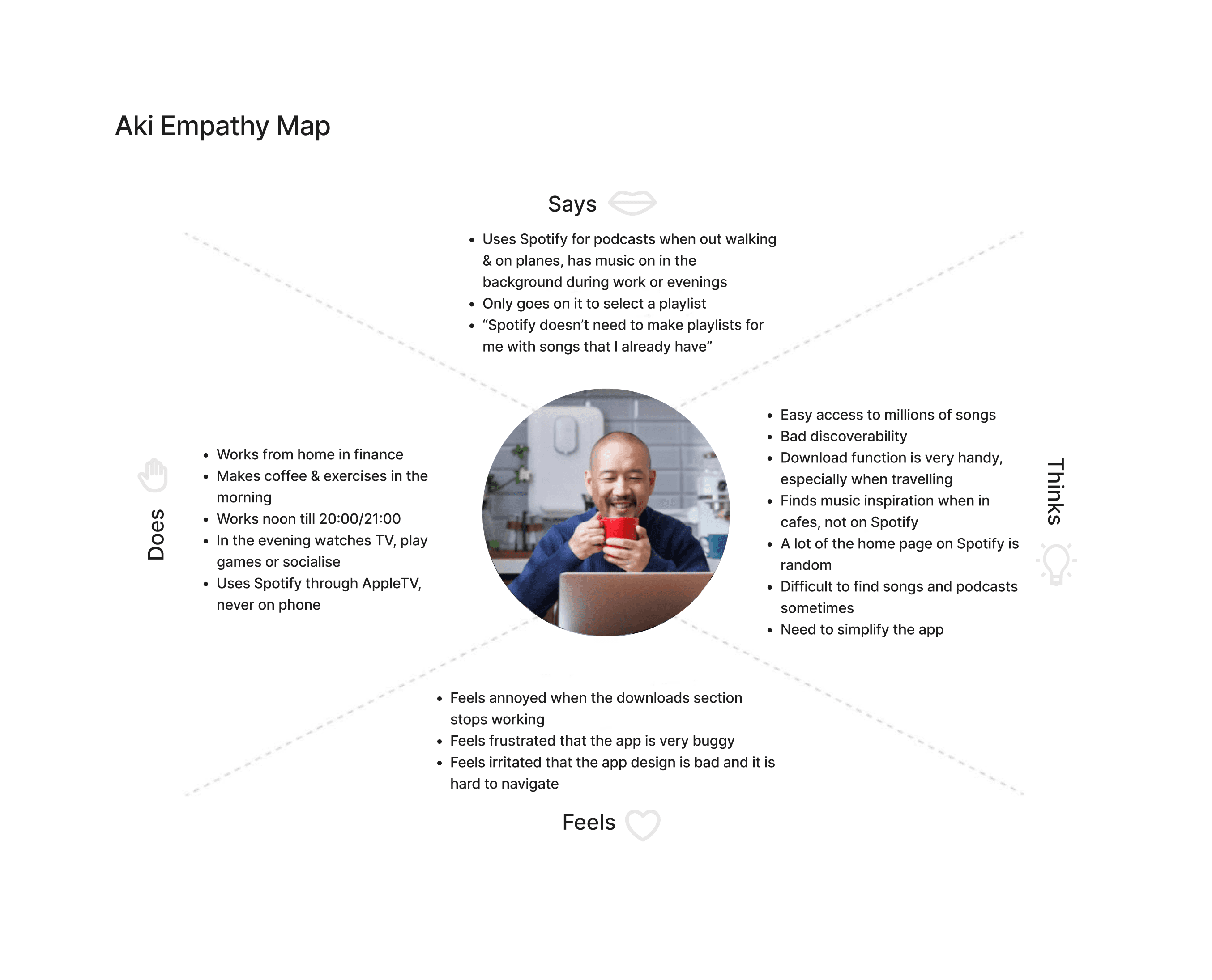
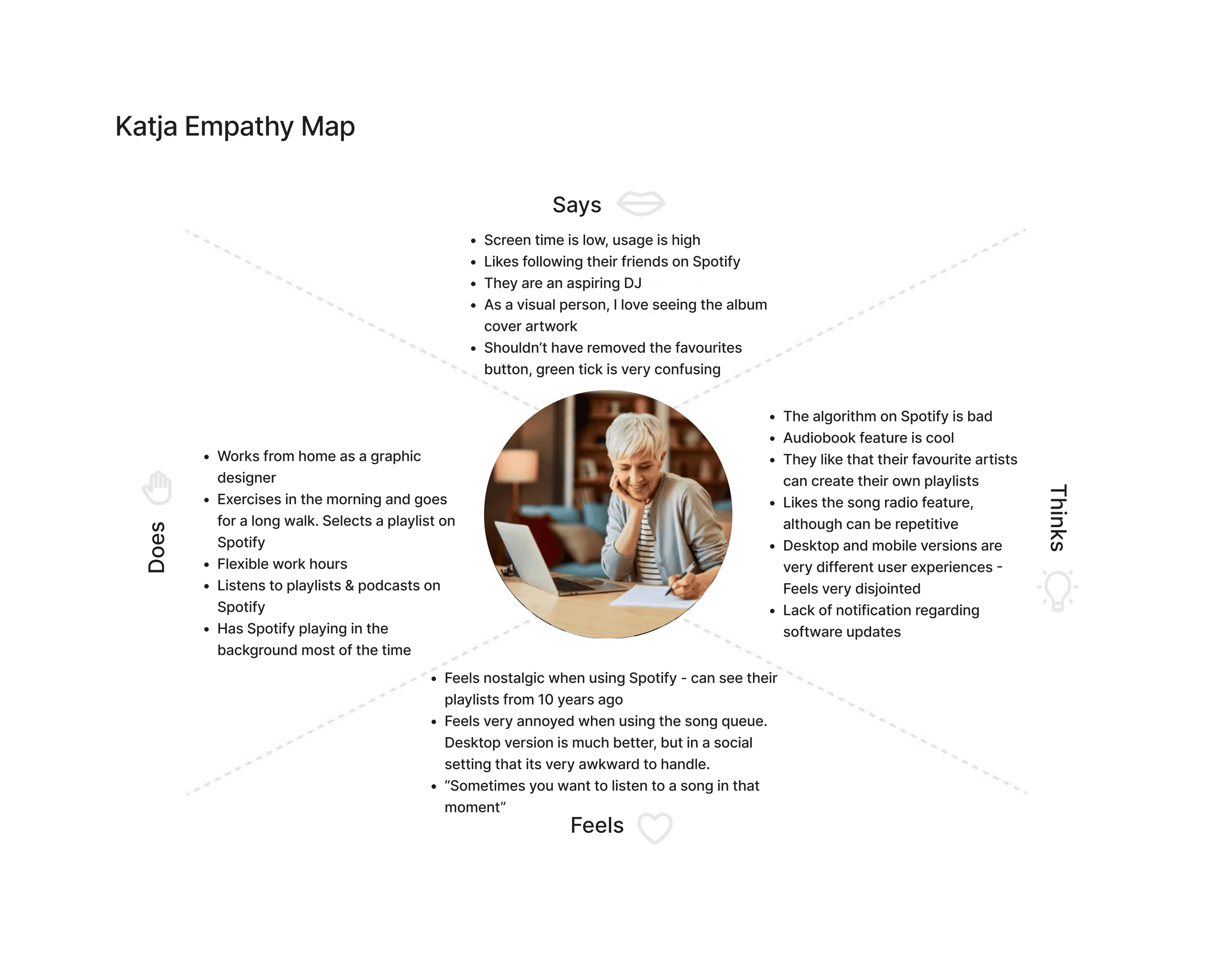
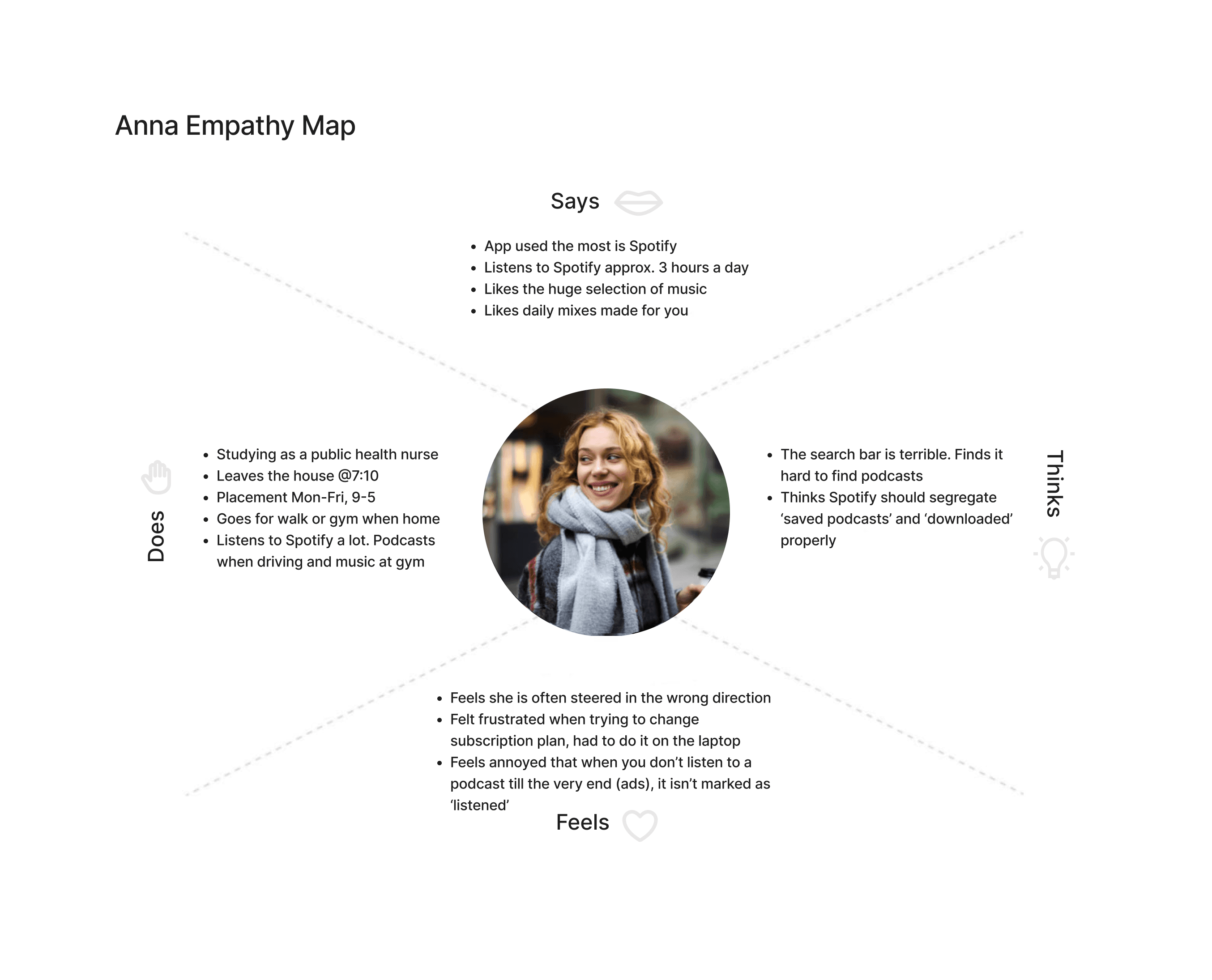
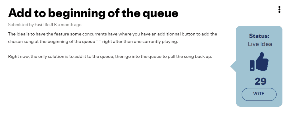
Spotify users face several issues when using the streaming platform. These range from technical difficulties to user experience problems, such as poor discoverability and recommendations, frequent app crashes and bugs, search functionality being clunky or inaccurate and finally, playlist management and sorting. This is the area that I wanted to improve.

Solution

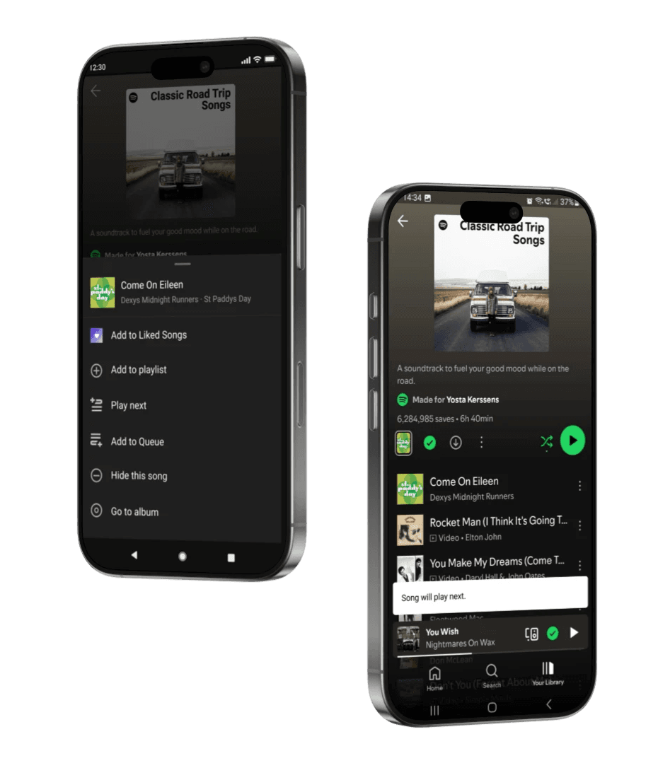
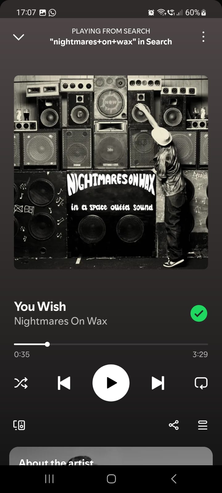
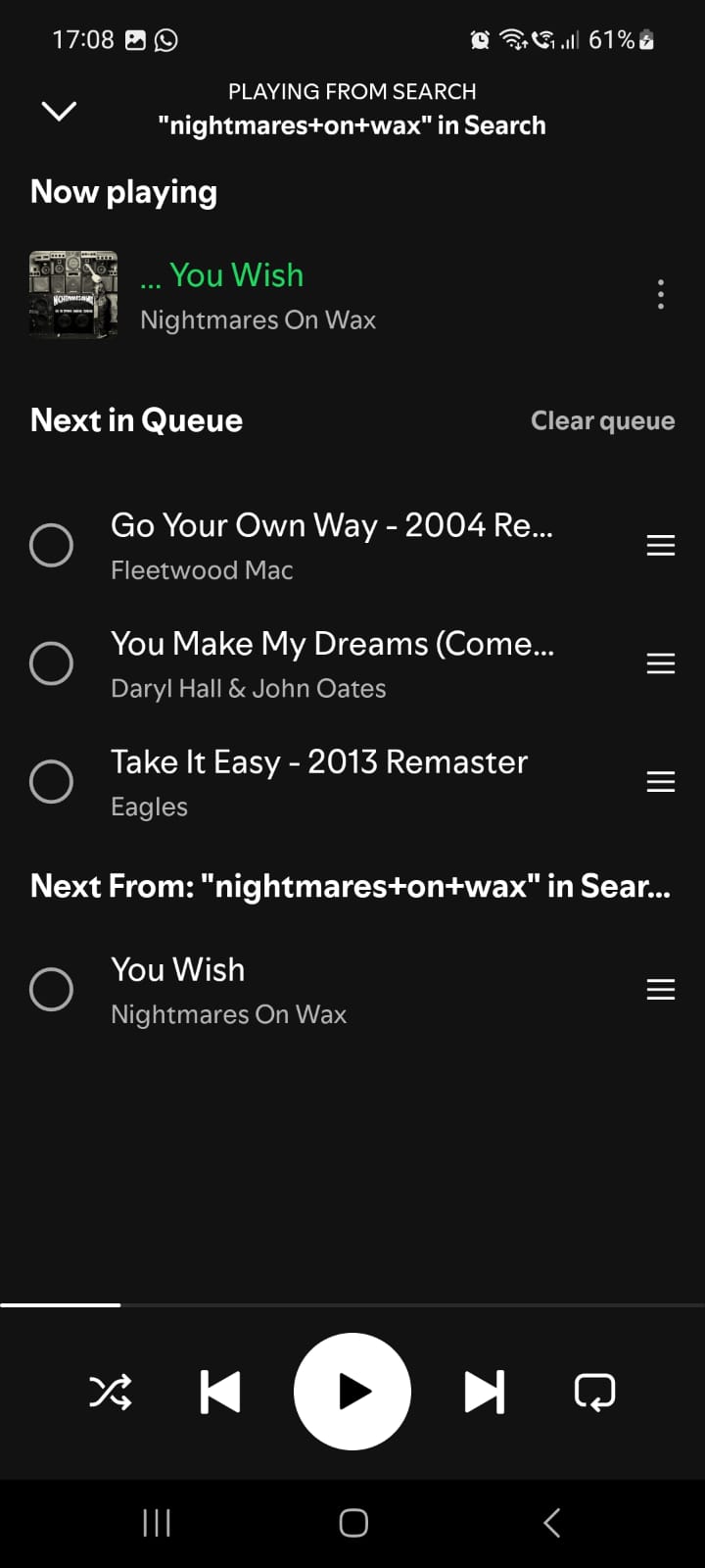
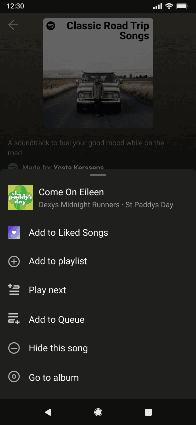
As a Spotify user, the 'Play Next' feature in the Song Queue is the one I'm most passionate about designing. Many users have also voiced frustration with the Song Queue's lack of intuitive design, particularly in social settings. This feature allows users to instantly skip to a song without the need to add it to the queue and manually move it to the top, streamlining the listening experience.

  • User Research

  • User Flows

  • Wireframes

  • Low/Hi-Fi Prototypes

  • Mockup

  • User Research

  • User Flows

  • Wireframes

  • Low/Hi-Fi Prototypes

  • Mockup

Tools

My Role

  • UX Research

  • UX Design

  • UI Design

  • Branding

Timeline

Timeline

Process

Process

  • Figma

  • FigJam

  • Photoshop

  • Microsoft Office

  • Figma

  • FigJam

  • Photoshop

  • Microsoft Office

  • 1 month

  • Personal project

Research

The objective of this phase was to generate empathy maps, based on my user interviews. Next, I created user personas and crafted user stories for them.

Empathy Maps

User Profiles

  1. Poor discoverability

  2. Repetitive algorithm (daily mixes + song radio)

  3. Song queue difficult to use

  4. Favourite songs unclear


Among the four pain points identified through user interviews, implementing the ‘Play Next’ feature proved to be the most feasible solution.

“Sometimes you just want to listen to a song in that moment”

Pain Points

Online Reviews

Research Findings

During the user interviews, one participant shared an insightful idea, prompting me to validate a key finding from my research. I reviewed online feedback and cross-examined my qualitative and quantitative data. In both the user interviews (qualitative) and online reviews (quantitative), frustration with the Song Queue emerged as a common theme. Additionally, as someone who personally experiences frustration with the Song Queue, I was motivated to design a solution specifically addressing this issue.


These insights, combined with user interviews, informed the design of the 'Play Next' feature, ensuring it addressed real user concerns and improved the overall user experience. The connection between the qualitative and quantitative data guided and informed my ideation process.

Research

Ideation

Design

Outcome

Research

Ideation

Design

Outcome

Design

User Flow

Based on the research I had conducted, I designed an intuitive feature that would remove any friction from the current user experience. I constructed the user flow, followed by the final design.

New Feature

Currently on Spotify, users have to perform five gestures in order to play a song next once they have activated the song queue, meaning they already have several songs in the queue.

Tap 3 dots on song you want to play next

Tap Add to Queue

Tap current song playing

Tap Queue icon (3 lines)

Drag song to the top of the Queue

By adding the simple feature 'Play Next' to the 'More Song Options' for a song, the process is simplified from 5 gestures to 1. Currently, playing a song next on the platform creates a lot of friction for the user and disrupts the overall experience, especially when the song queue is large.

Tap 3 dots on song you want to play next

Play next

'Add to Queue' Toast message

'Play next' Toast message

The toast message for the new 'Play next' feature follows the same design as the current 'Add to Queue' feature to maintain consistency across all screens.

I designed the screens for the new 'Play Next' feature from the ground up, refining my UI skills in the process.

Research

Ideation

Design

Outcome

Research

Ideation

Design

Outcome

Outcome

What I Learned


  • Designing the 'Play Next' feature for Spotify strengthened my UX/UI skills and user-centred approach. Through interviews, empathy maps, and user profiles, I identified real pain points and tailored the experience accordingly. A competitive audit informed best practices, while designing screens from scratch refined my ability to balance aesthetics with usability. This project sharpened my creativity, user focus, and iterative design process.

What's Next?


  • I recommend simplifying the ‘Favourites’ playlist, as it currently feels very clunky. Several users mentioned in the user interviews that it caused confusion and frustration, and I found similar feedback in online reviews. To address this, I propose a simple change: adding a ‘+’ button alongside a heart icon. This solution combines the best of both functionalities while enhancing the user experience.

New 'Play Next' Feature

Research

Ideation

Design

Outcome

Research

Ideation

Design

Outcome

The goal of this phase was to determine the value proposition and a goal statement. I then conducted a competitive audit.

Ideation

Spotify stands out with its personalized listening experience, extensive content library, and seamless cross-platform access. It combines convenience, variety, social sharing, and innovative features, offering both free and premium options to meet diverse user needs. Additionally, it is the only music streaming service that provides access to music, podcasts, and audiobooks all on one platform.

Competitive Audit Findings

I discovered that all of Spotify's competitors have the 'Play Next' feature, further validating my research. Tidal and YouTube (YT) Music do this the best, although both designs have flaws.

Value Proposition

Competitive Audit

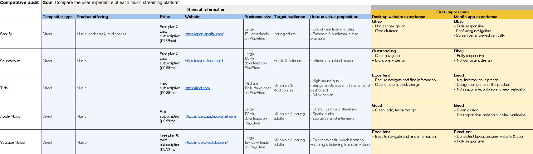
I conducted a competitive audit with Spotify, Soundcloud, Tidal, Apple Music and YouTube Music.

Tidal - Play Next

Tidal - Toast message

YT Music - Play Next

YT Music - Toast message

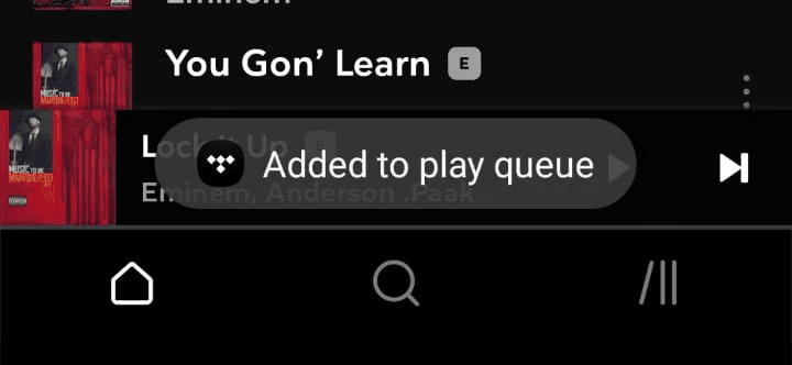
The Tidal app does this very well. It is clear and well designed. It has the 'Play next' and 'Add to play queue' features.


However, once the 'Play next' feature is selected, a toast message 'Added to play queue’ pops up. The same message also appears when the user selects 'Add to play queue'.

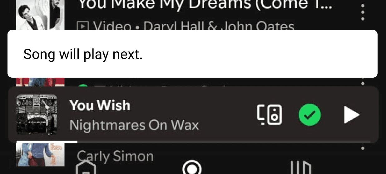
The YouTube (YT) Music app also has the 'Play next' and 'Add to queue' features, but the design is a bit confusing. A simplified list would streamline the experience.


Once the 'Play next' feature is selected, a toast message 'Song will play next’ pops up, clearly confirming the users choice.

Research

Ideation

Design

Outcome

Design

User Flow

Based on the research I had conducted, I designed an intuitive feature that would remove any friction from the current user experience. I constructed the user flow, followed by the final design.

New Feature

Currently on Spotify, users have to perform five gestures in order to play a song next once they have activated the song queue, meaning they already have several songs in the queue.

Tap 3 dots on song you want to play next

Tap Add to Queue

Tap current song playing

Tap Queue icon (3 lines)

Drag song to the top of the Queue

By adding the simple feature 'Play Next' to the 'More Song Options' for a song, the process is simplified from 5 gestures to 1. Currently, playing a song next on the platform creates a lot of friction for the user and disrupts the overall experience, especially when the song queue is large.

Tap 3 dots on song you want to play next

Play next

'Add to Queue' Toast message

'Play next' Toast message

The toast message for the new 'Play next' feature follows the same design as the current 'Add to Queue' feature to maintain consistency across all screens.

I designed the screens for the new 'Play Next' feature from the ground up, refining my UI skills in the process.

Research

Ideation

Design

Outcome

Outcome

What I Learned


  • Designing the 'Play Next' feature for Spotify strengthened my UX/UI skills and user-centred approach. Through interviews, empathy maps, and user profiles, I identified real pain points and tailored the experience accordingly. A competitive audit informed best practices, while designing screens from scratch refined my ability to balance aesthetics with usability. This project sharpened my creativity, user focus, and iterative design process.

What's Next?


  • I recommend simplifying the ‘Favourites’ playlist, as it currently feels very clunky. Several users mentioned in the user interviews that it caused confusion and frustration, and I found similar feedback in online reviews. To address this, I propose a simple change: adding a ‘+’ button alongside a heart icon. This solution combines the best of both functionalities while enhancing the user experience.

New 'Play Next' Feature

© Yosta Kerssens 2025 | Designer | yosta.kerssens210@gmail.com

See more of my work:

RecycleBuddy

Responsive App

MyGP

Responsive App + Website

© Yosta Kerssens 2025 | Designer | yosta.kerssens210@gmail.com