

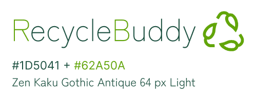
RecycleBuddy
RecycleBuddy
RESPONSIVE APP
RESPONSIVE APP
Your Personalised Recycling Assistant
RecycleBuddy has a simple, user-friendly interface and provides personalized guidance to help users manage waste, track recycling efforts and find local recycling facilities. Whether you're new to recycling or a seasoned pro, RecycleBuddy helps you make informed decisions on proper disposal and reduce waste, supporting a sustainable lifestyle and a cleaner, greener environment.
Problem
Users face several challenges with waste management and recycling.
These include:
1. Difficulty remembering to take out the bins, leading to missed waste collections and overflowing bins that start to smell.
2. Confusion about what can and can't be recycled, particularly with plastics, making it hard for users to manage recycling effectively.
3. Frustration with the lack of recycling efforts in their community, as many feel others aren't making enough effort to recycle.
Solution
RecycleBuddy is an informative solution that helps users manage waste and support recycling habits. It sends reminders to take out the bins on time, preventing overflow. The app also provides clear recycling guidelines, especially for confusing items like plastics, helping users dispose of waste correctly. By simplifying waste management and encouraging recycling, RecycleBuddy supports users in adopting sustainable habits and reducing their environmental impact.

Design after usability testing - I streamlined the app’s core features for greater simplicity and focus.


"Scan, Sort, Recycle, Reward"
The barcode scanning feature and reward system were ultimately abandoned after the first usability test, as they added unnecessary complexity to the app and did not align with the core goal of simplifying the recycling process. User feedback suggested that a more straightforward, intuitive experience would be more effective in promoting consistent recycling habits.
Paper + digital wireframes before usability testing
First, I designed Storyboards and created Wireframes. Next, I modified my designs based on the Insights I gathered from a Moderated Usability Test I had conducted. I then worked on the Branding and crafted the User Interface, while also implementing Accessibility standards. I subsequently created a Mockup and carried out another Usability Test, before wrapping up with the Hi-Fi Prototype.
Research
Ideation
Design
Test
Outcome
Research
Ideation
Design
Test
Outcome
Wireframes
Design

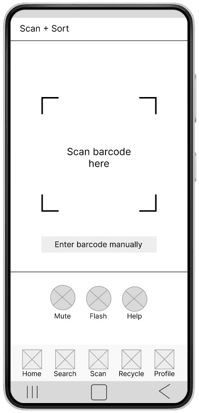

1st iteration - Scan the barcode feature
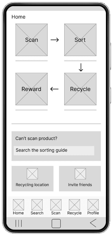
1st iteration - Home screen
Design before usability testing

Home Screen Development


Logo design development
Branding
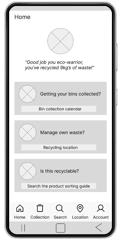
2nd iteration - Home screen

Changed colour scheme (more earthy + green)
Updated calendar (Mon-Sun)
There are too many different colours in the first iteration. I used the same colours as the illustrations for the calendar.
Simplified button (copy was too long in 1st iteration)
I took inspiration from Mobbin to study App UI design. I really honed my UI skills in this project
Changed the colour scheme to feel more earthy + aligned with the theme
Professional + friendly look in 2nd iteration
Typography: Franklin Gothic Book + Merriweather > Montserrat Alternatives + Zen Kahu Gothic Antique (softer + more modern)
UI changes made
To meet accessibility standards, I used A11y Colour Contrast Checker plug-in in Figma to measure contrast ratio of text against background colours. The minimum contrast ratio for text is at least 4:5:1, following AA compliance level and 7:1 following AAA compliance level.


After - Updated look + feel
Splash screen
After- Updated look + feel
Bin collection calendar
Rinse & Recycle,
Wash & Squash!
Bin Collection Calendar
Recycling fun
for everyone!
Splash Screen
Accessibility
Before - First iteration
Bin collection calendar
Before - First iteration
Splash screen
UI changes made
Onboarding
Waste, Rubbish, Trash, get it all collected!

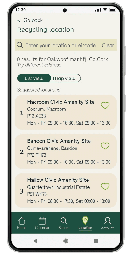
Recycling centre locations
3 Results & All (126) Results
List View + Map View
Wrong address? No problem!
Suggested Locations
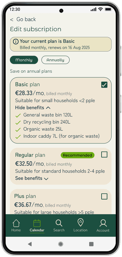
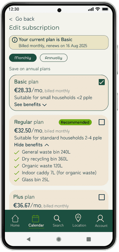
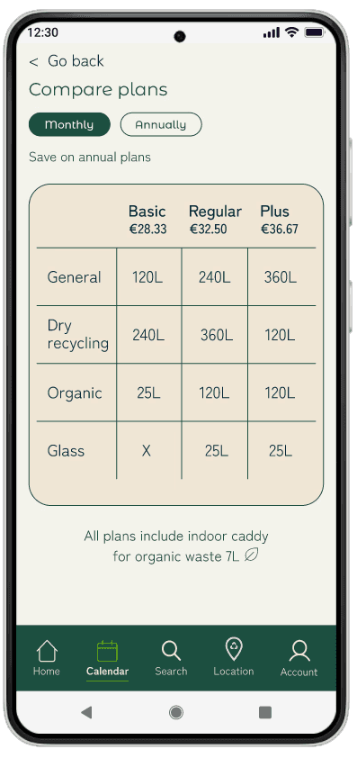
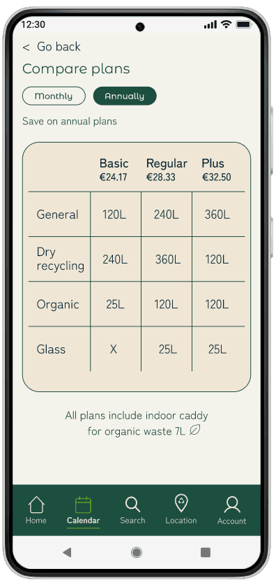
Subscription plans

Users can find and manage waste by locating nearby recycling centres across Ireland, with address and contact details provided. Centres can be searched by address or found via an interactive map, with results shown in list or map view.
The app provides clear recycling guidelines in the product sorting guide. This is especially useful for confusing items like plastics, helping users dispose of waste correctly.
Users can sign up for a subscription to the bin collection service. It also sends reminders to take out the bins on time, preventing overflow.

User Research
User Flows
Wireframes
Usability Studies
Low/Hi-Fi Prototypes
Mockup
Tools
My Role
UX Research
UX Design
UI Design
Branding
Timeline
Process
Figma
FigJam
Photoshop
Microsoft Office
Maze
Mobbin
2 months
Personal project
User Research
User Flows
Wireframes
Usability Studies
Low/Hi-Fi Prototypes
Mockup
Tools
My Role
UX Research
UX Design
UI Design
Branding
Timeline
Process
Figma
FigJam
Photoshop
Microsoft Office
Maze
Mobbin
2 months
Personal project
Research
Ideation
Design
Test
Outcome
Research
The objective of this phase was to generate empathy maps, based on my user interviews. Next, I created user personas and crafted user stories for them. I then produced user journey maps for each persona.
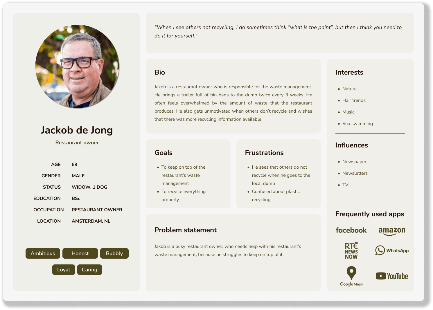
User Profiles & Problem Statements

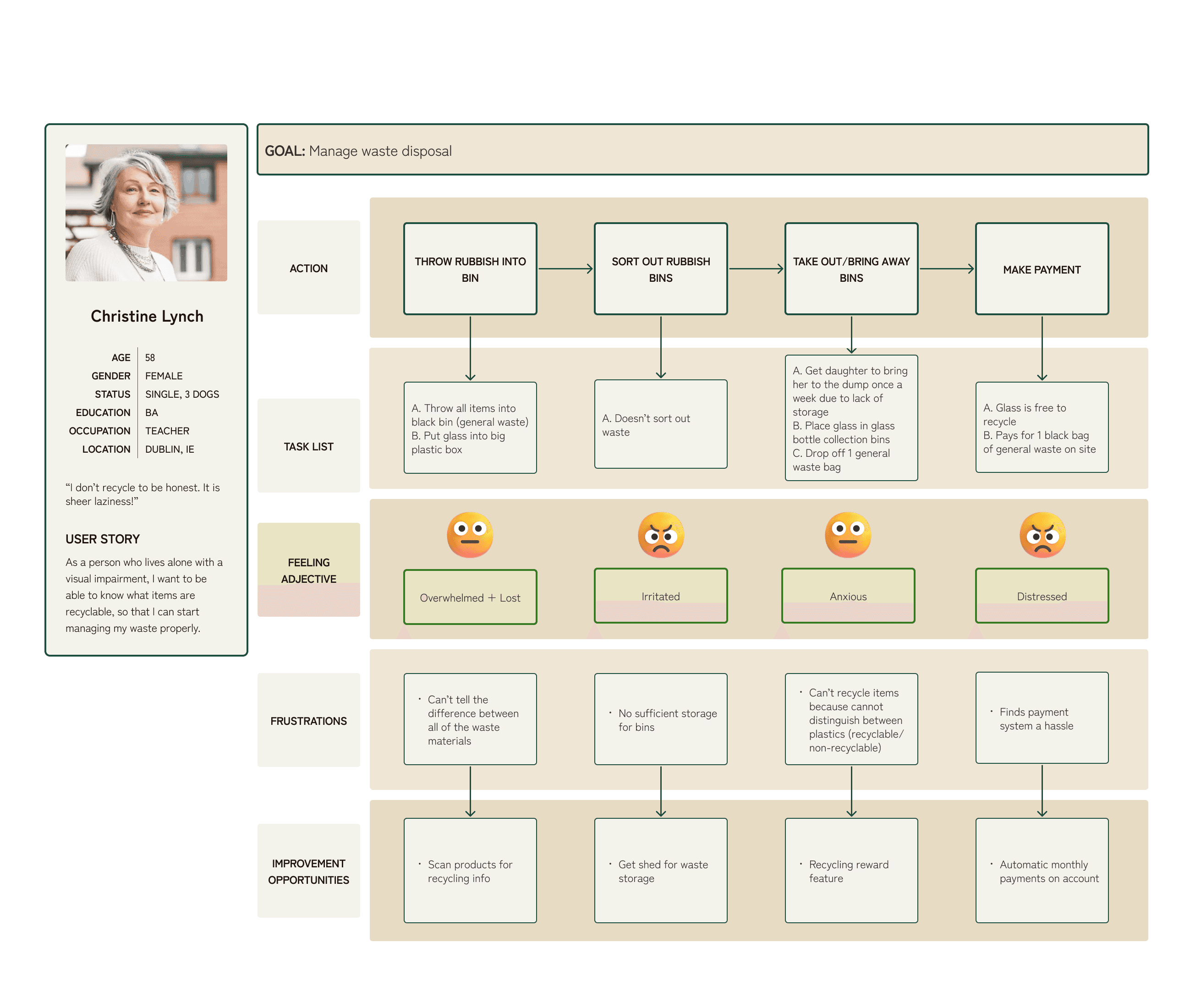

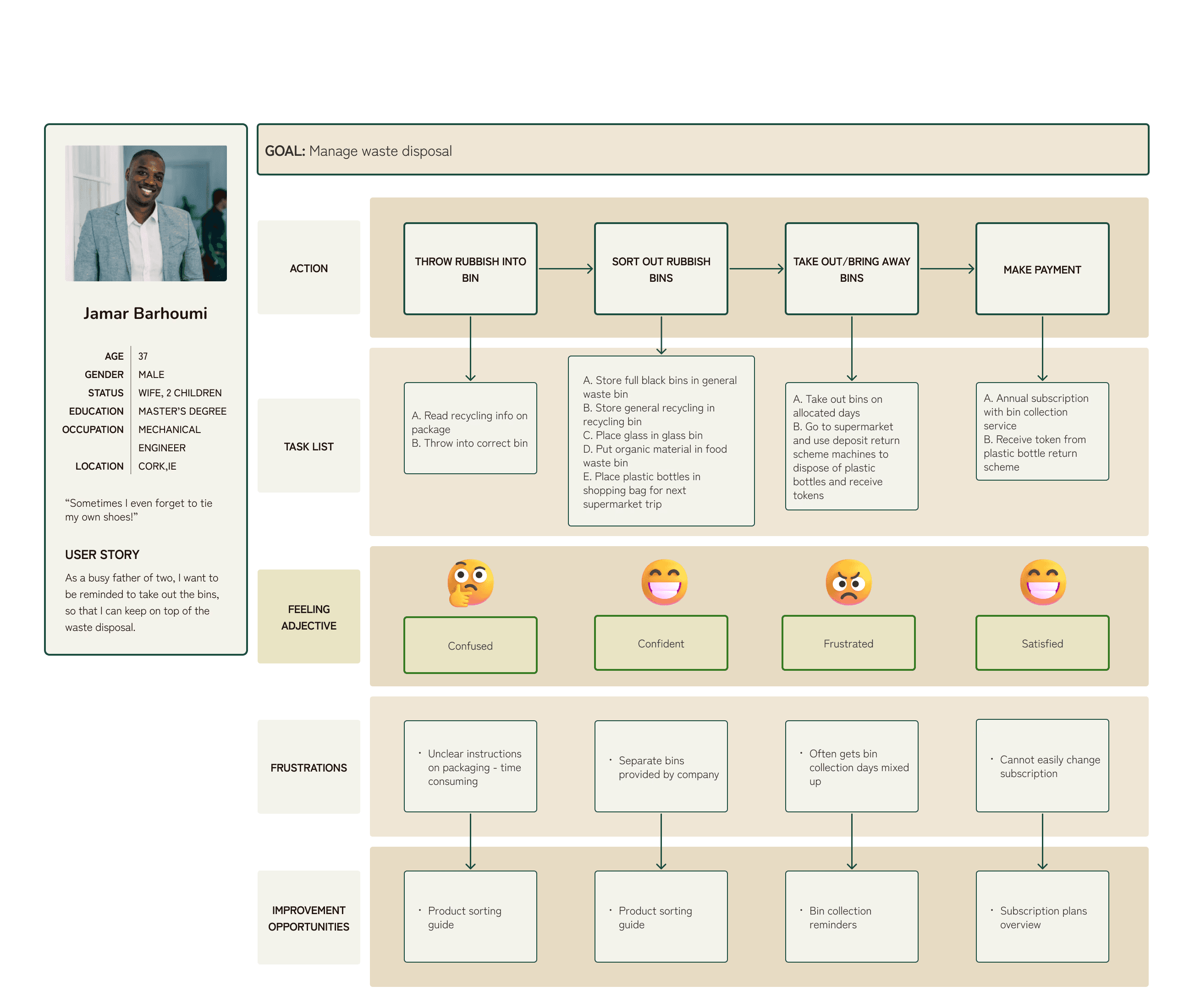
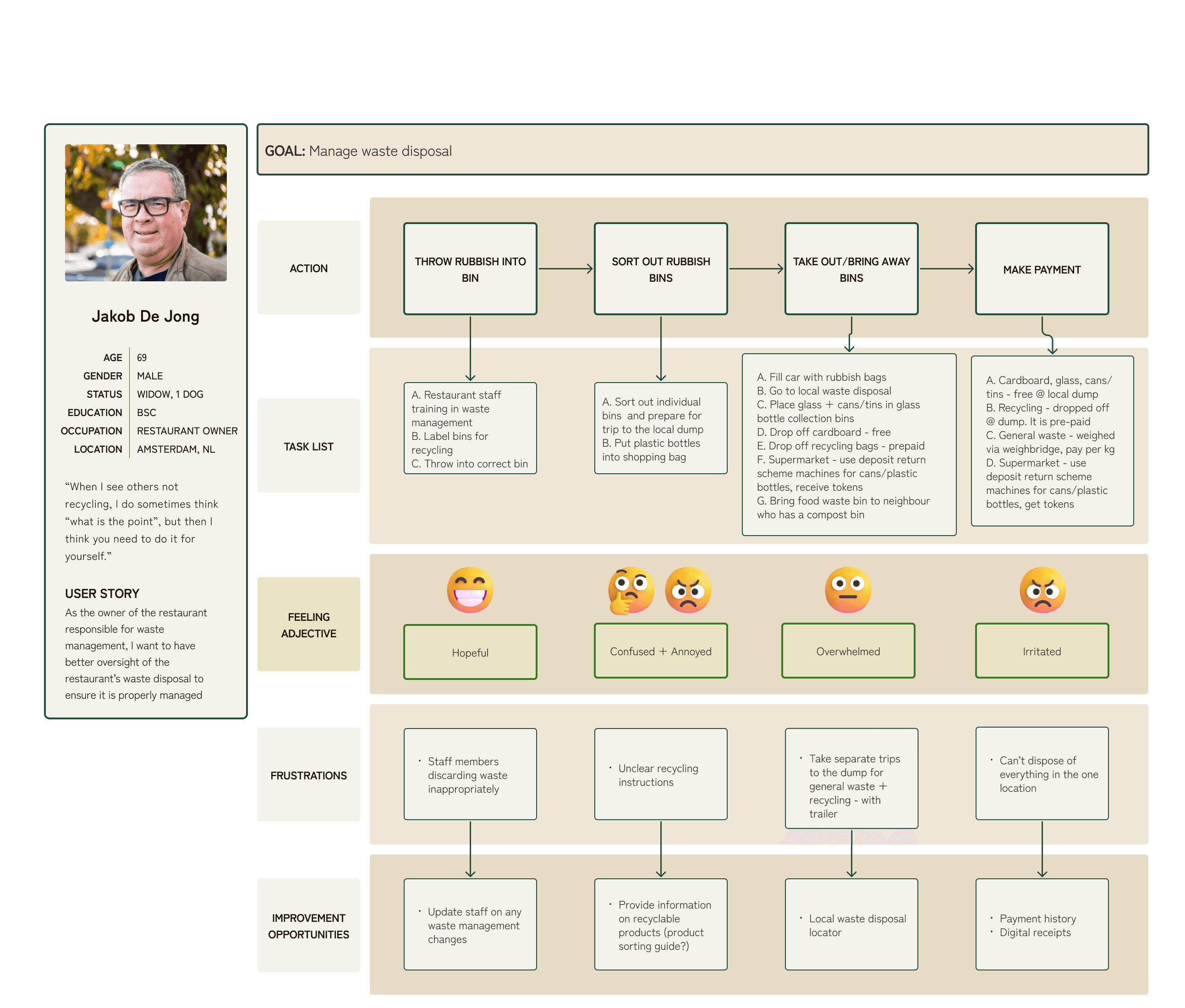
User Journey Maps
Insights into what the users want
Bin collection reminders
Subscription plans
Scan products for recycling info
Recycling reward feature
Payment history

Digital receipts
Local waste disposal locator
Provide information on recyclable products (product sorting guide?)
Recycling tracker (how many Kg’s of waste)
Research
Ideation
Design
Test
Outcome
Goal Statement
RecycleBuddy helps users manage their waste by providing personalized reminders, clear recycling guidelines and easy tracking of recycling efforts, benefiting both homeowners and business owners.
Site Map

The initial site map, created before the first usability testing, included a barcode scanning feature and an incentive-based reward system to encourage recycling.
Following the first usability testing, I streamlined the app’s core features for greater simplicity and focus.
In order to simplify, I prioritised these 3 areas:
Find useful recycling information in product sorting guide
Subscribe to bin collection service
Manage own waste by locating your nearest recycling centre
Hypothesis Statement
The goal of this phase was to define hypothesis statements, based on the problem statements. Next, I determined a value proposition and a goal statement. I then conducted a competitive audit. Finally, I constructed the user flow and site map.
Ideation

If Claire uses the RecycleBuddy app to access up-to-date recycling information, then she will be able to easily understand recycling regulations and make informed decisions.

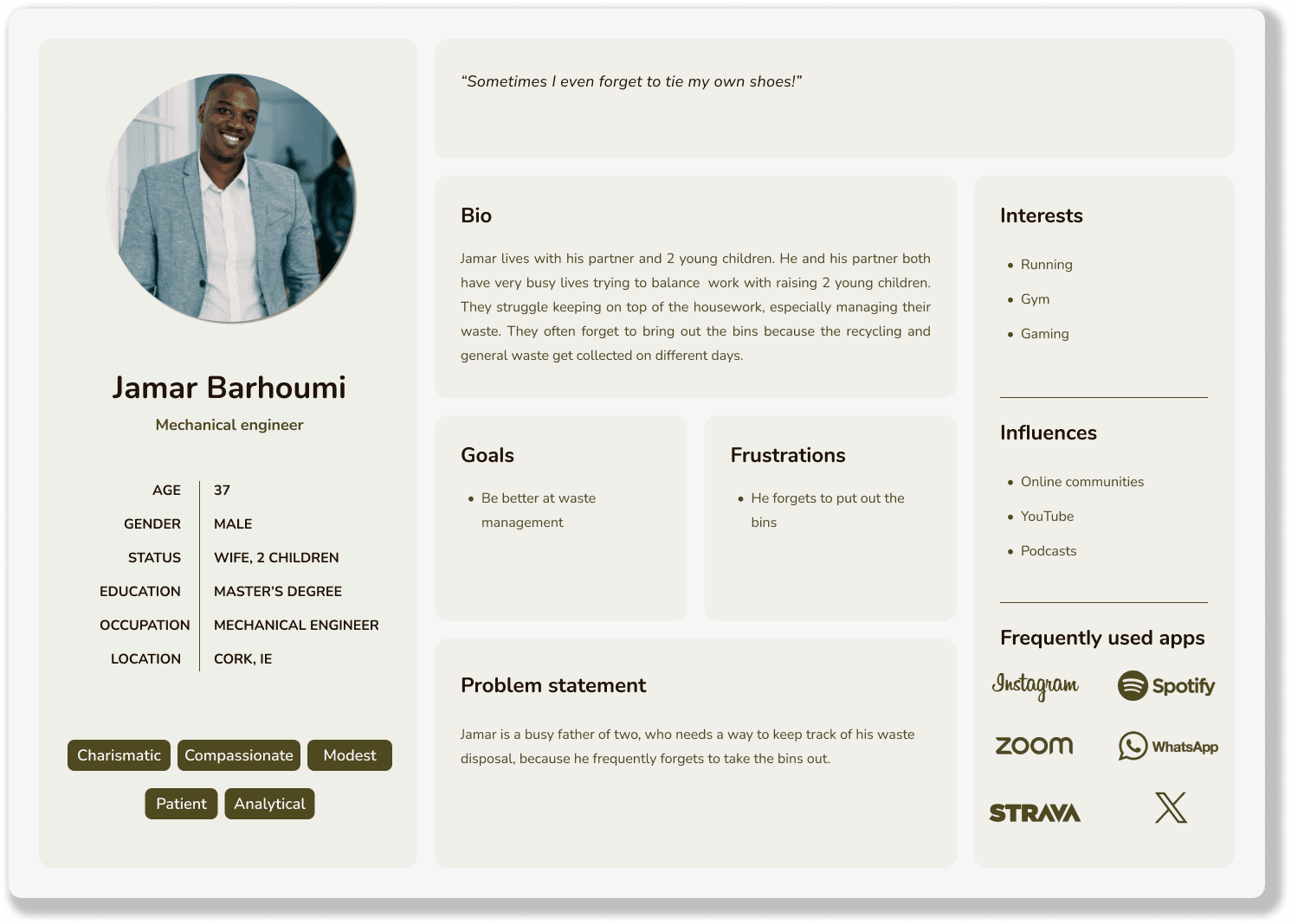
If Jamar receives notification reminders from the RecycleBuddy app,
then he will remember to take out the bins on time.

If Jakob uses the RecycleBuddy app to manage his restaurant’s waste,
then he will feel confident in staying organized and on top of waste management tasks.

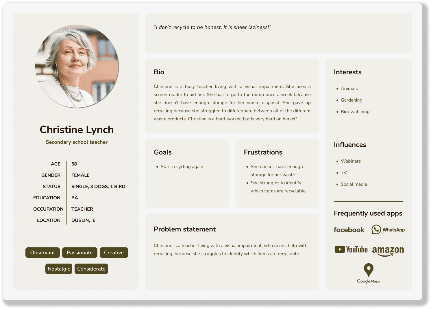
If Christine uses the RecycleBuddy app to scan barcodes on empty packages,
then she will be able to easily determine which items are recyclable and begin recycling her waste.
Research
Ideation
Design
Test
Outcome
Wireframes
First, I designed Storyboards and created Wireframes. Next, I modified my designs based on the Insights I gathered from a Moderated Usability Test I had conducted. I then worked on the Branding and crafted the User Interface, while also implementing Accessibility standards. I subsequently created a Mockup and carried out another Usability Test, before wrapping up with the Hi-Fi Prototype.
Design
Paper + digital wireframes before usability testing
1st iteration - Scan the barcode feature
"Scan, Sort, Recycle, Reward"
The barcode scanning feature and reward system were ultimately abandoned after the first usability test, as they added unnecessary complexity to the app and did not align with the core goal of simplifying the recycling process. User feedback suggested that a more straightforward, intuitive experience would be more effective in promoting consistent recycling habits.
Home Screen Development
1st iteration - Home screen
Design before usability testing
Design after usability testing - I streamlined the app’s core features for greater simplicity and focus.
2nd iteration - Home screen
Branding
Logo design development
Splash Screen
Accessibility
To meet accessibility standards, I used A11y Colour Contrast Checker plug-in in Figma to measure contrast ratio of text against background colours. The minimum contrast ratio for text is at least 4:5:1, following AA compliance level and 7:1 following AAA compliance level.
Before - First iteration
Splash screen
After - Updated look + feel
Splash screen
Bin Collection Calendar
Before - First iteration
Bin collection calendar
After - Updated look + feel
Bin collection calendar
Onboarding
The app provides clear recycling guidelines in the product sorting guide. This is especially useful for confusing items like plastics, helping users dispose of waste correctly.
Rinse & Recycle,
Wash & Squash!
Waste, Rubbish, Trash,
get it all collected!
Recycling fun for everyone!
Users can sign up for a subscription to the bin collection service. It also sends reminders to take out the bins on time, preventing overflow.
Users can find and manage waste by locating nearby recycling centres across Ireland, with address and contact details provided. Centres can be searched by address or found via an interactive map, with results shown in list or map view.
Subscription plans
I took inspiration from Mobbin to study App UI design. I really honed my UI skills in this project
Changed the colour scheme to feel more earthy + aligned with the theme
Professional + friendly look in 2nd iteration
Typography: Franklin Gothic Book + Merriweather > Montserrat Alternatives + Zen Kahu Gothic Antique (softer + more modern)
UI changes made
Changed colour scheme (more earthy + green)
Updated calendar (Mon-Sun)
There are too many different colours in the first iteration. I used the same colours as the illustrations for the calendar.
Simplified button (copy was too long in 1st iteration)
UI changes made
Wrong address? No problem!
Suggested Locations
3 Results & All (126) Results
List View + Map View
Recycling centre locations

Research
Ideation
Design
Test
Outcome
Affinity Diagram of Aggregated Findings from Moderated Usability Test
I employed both Qualitative and Quantitative methods during testing. I conducted 1 initial Moderated Usability Test with 3 participants and 2 Unmoderated Usability Tests with a total of 10 unique users participating across both tests. Users provided feedback using the System Usability Scale.
Test

“This is a handy guide. I would probably use this more than the scan function because some things like hoovers, metals etc. don't have barcodes.”
User Feedback from Unmoderated Usability Test

Measuring Effectiveness
I would track Key Performance Indicators (KPIs) such as User Engagement. I would measure how many users are actively using the app over specific periods (daily, weekly, monthly). A higher frequency of use suggests users find it valuable. If possible, I would track the amount (weight/volume) of recyclables users report or input in the app. A steady increase in this metric over time indicates that the app is encouraging more recycling behaviour.
Research
Ideation
Design
Test
Outcome
Outcome

Product Sorting Guide
Bin Collection Service

Recycling Centre Locations

My Account
What I Learned
RecycleBuddy was a rewarding project that strengthened my skills in user research, problem-solving and designing for impact. I identified common challenges in waste management—missed bin collections, recycling confusion and difficulty locating recycling centres—and addressed them through features like a bin reminder, product sorting guide and location-based centre finder. The app’s intuitive flow and localised content make recycling simpler and more accessible for Irish users. Regular user and mentor feedback helped refine the design. This project highlighted how thoughtful UX can encourage sustainable behaviour and create positive, real-world change.
What's Next?
To further develop this product, I would design a personalized waste reduction plans feature. Based on user habits, create personalized waste reduction plans with tailored goals and tips (reducing plastic, composting more, etc.).
Introduce a gamification and rewards system where users earn points or badges for recycling regularly, hitting milestones or completing challenges.
Include local news such as community initiatives and events (beach clean-up efforts).
Partnership with local businesses for eco-friendly products. Offer a section that promotes local businesses that sell sustainable or eco-friendly products, or reward users for supporting these businesses.
© Yosta Kerssens 2025 | Designer | yosta.kerssens210@gmail.com
See more of my work:
MyGP
Responsive App + Website

Spotify
New Added Feature

Research
The objective of this phase was to generate empathy maps, based on my user interviews. Next, I created user personas and crafted user stories for them. I then produced user journey maps for each persona.
User Profiles & Problem Statements
Research
Ideation
Design
Test
Outcome
Research
Ideation
Design
Test
Outcome
Bin collection reminders
Subscription plans
Scan products for recycling info
Recycling reward feature
Payment history
Digital receipts
Local waste disposal locator
Provide information on recyclable products (product sorting guide?)
Recycling tracker (how many Kg’s of waste)
User Journey Maps
Insights into what the users want
© Yosta Kerssens 2025 | Designer | yosta.kerssens210@gmail.com
© Yosta Kerssens 2025 | Designer
Hypothesis Statement
Ideation
If Christine uses the RecycleBuddy app to scan barcodes on empty packages,
then she will be able to easily determine which items are recyclable and begin recycling her waste.
If Jakob uses the RecycleBuddy app to manage his restaurant’s waste,
then he will feel confident in staying organized and on top of waste management tasks.
If Jamar receives notification reminders from the RecycleBuddy app,
then he will remember to take out the bins on time.
If Claire uses the RecycleBuddy app to access up-to-date recycling information, then she will be able to easily understand recycling regulations and make informed decisions.
Research
Ideation
Design
Test
Outcome
Research
Ideation
Design
Test
Outcome
The goal of this phase was to define hypothesis statements, based on the problem statements. Next, I determined a value proposition and a goal statement. I then conducted a competitive audit. Finally, I constructed the user flow and site map.
Goal Statement
RecycleBuddy helps users manage their waste by providing personalized reminders, clear recycling guidelines and easy tracking of recycling efforts, benefiting both homeowners and business owners.
Site Map
The initial site map, created before the first usability testing, included a barcode scanning feature and an incentive-based reward system to encourage recycling.
Following the first usability testing, I streamlined the app’s core features for greater simplicity and focus.
In order to simplify, I prioritised these 3 areas:
Find useful recycling information in product sorting guide
Subscribe to bin collection service
Manage own waste by locating your nearest recycling centre
Research
Ideation
Design
Test
Outcome
Research
Ideation
Design
Test
Outcome
I would track Key Performance Indicators (KPIs) such as User Engagement. I would measure how many users are actively using the app over specific periods (daily, weekly, monthly). A higher frequency of use suggests users find it valuable. If possible, I would track the amount (weight/volume) of recyclables users report or input in the app. A steady increase in this metric over time indicates that the app is encouraging more recycling behaviour.
Measuring Effectiveness
User Feedback from Unmoderated Usability Test
“This is a handy guide. I would probably use this more than the scan function because some things like hoovers, metals etc. don't have barcodes.”
Affinity Diagram of Aggregated Findings from Moderated Usability Test
I employed both Qualitative and Quantitative methods during testing. I conducted 1 initial Moderated Usability Test with 3 participants and 2 Unmoderated Usability Tests with a total of 10 unique users participating across both tests. Users provided feedback using the System Usability Scale.
Test
Research
Ideation
Design
Test
Outcome
Research
Ideation
Design
Test
Outcome
Product Sorting Guide
Bin Collection Service
Recycling Centre Locations
My Account
Outcome
What I Learned
What's Next?
To further develop this product, I would design a personalized waste reduction plans feature. Based on user habits, create personalized waste reduction plans with tailored goals and tips (reducing plastic, composting more, etc.).
Introduce a gamification and rewards system where users earn points or badges for recycling regularly, hitting milestones or completing challenges.
Include local news such as community initiatives and events (beach clean-up efforts).
Partnership with local businesses for eco-friendly products. Offer a section that promotes local businesses that sell sustainable or eco-friendly products, or reward users for supporting these businesses.
RecycleBuddy was a rewarding project that strengthened my skills in user research, problem-solving and designing for impact. I identified common challenges in waste management—missed bin collections, recycling confusion and difficulty locating recycling centres—and addressed them through features like a bin reminder, product sorting guide and location-based centre finder. The app’s intuitive flow and localised content make recycling simpler and more accessible for Irish users. Regular user and mentor feedback helped refine the design. This project highlighted how thoughtful UX can encourage sustainable behaviour and create positive, real-world change.