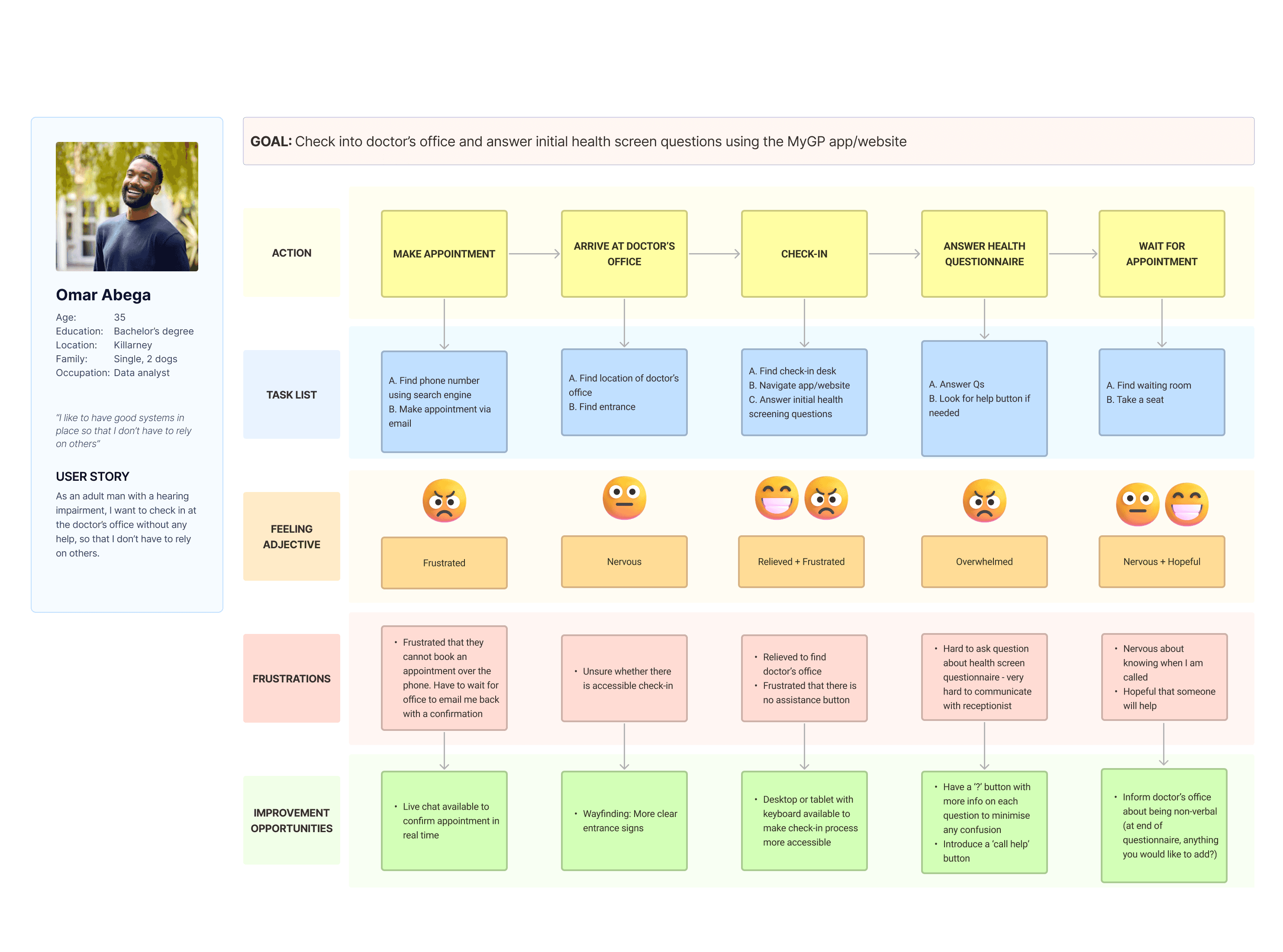
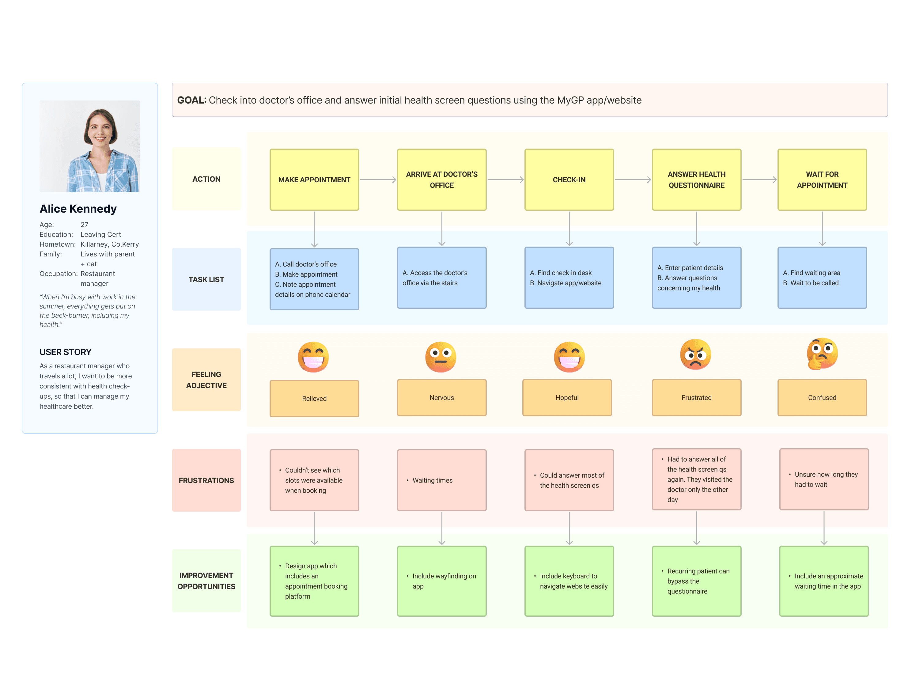
MyGP
RESPONSIVE WEBSITE + APP
Effortless Check-Ins, Smarter Healthcare
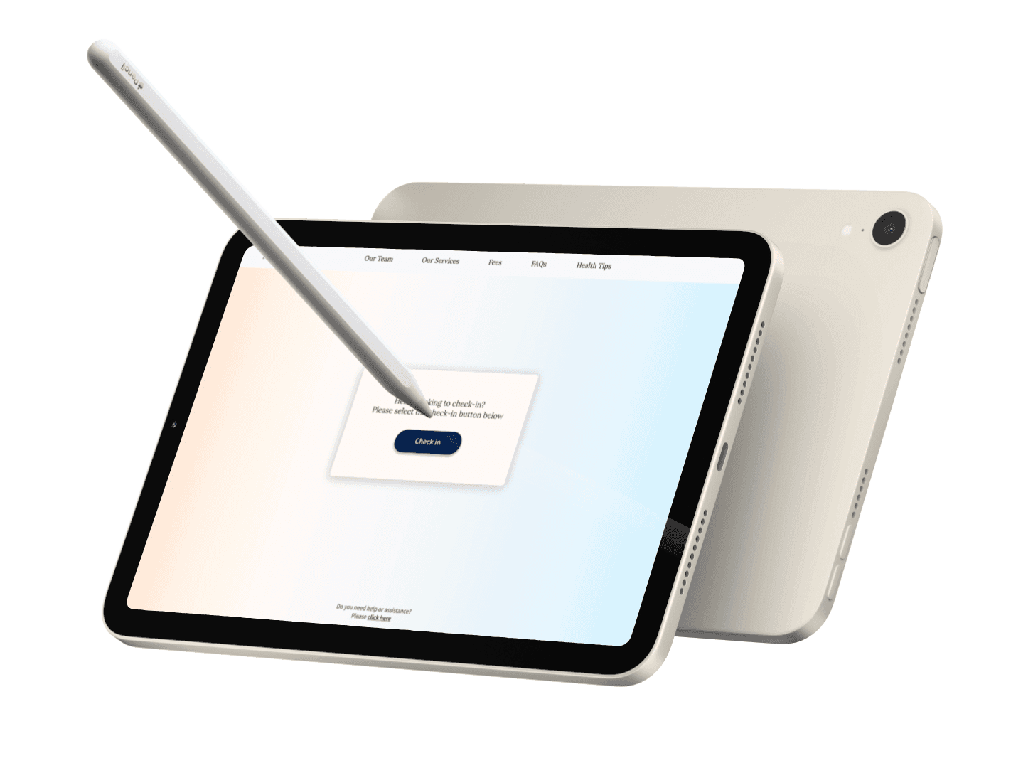
MyGP allows patients to independently check in at their family doctor’s office using their personal mobile, tablet or a reception screen. The easy-to-use platform includes an initial health screening questionnaire to ensure patients can manage their healthcare effectively. With assistive technology for accessibility, it streamlines the check-in process, reduces wait times, and improves overall patient experience.
Research
Ideation
Design
Test
Outcome
Research
Ideation
Design
Test
Outcome
Test
I conducted a Moderated Usability Test. Users provided feedback using the System Usability Scale.
Actionable Insights Implemented from Usability Testing
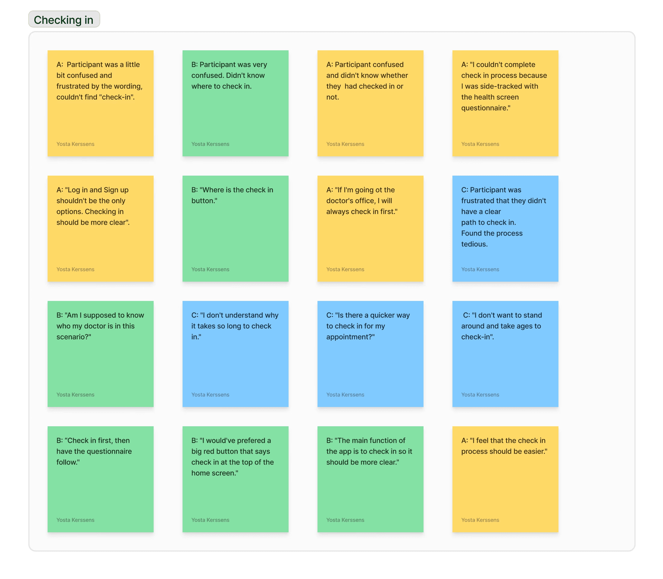
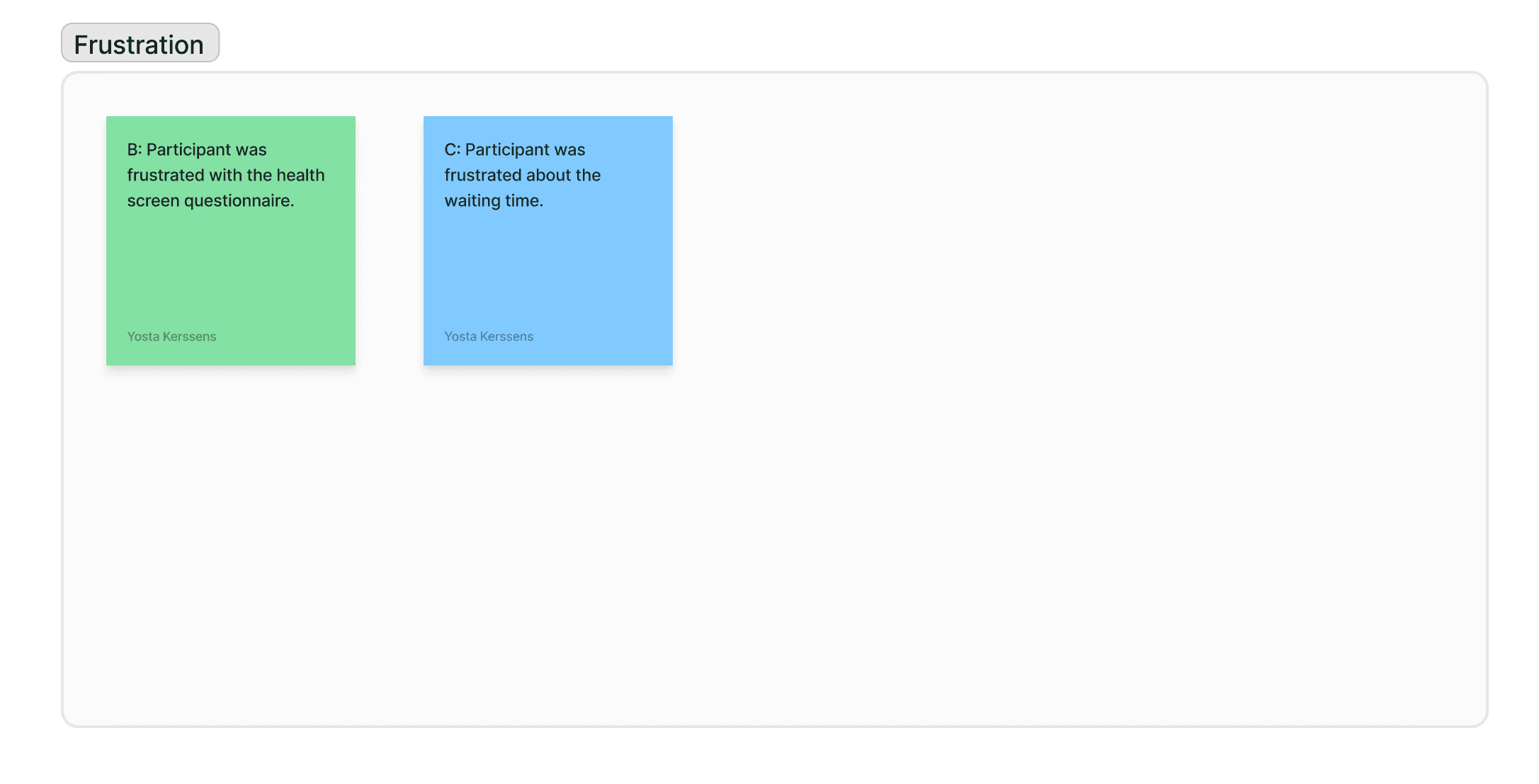
Affinity Diagram of Aggregated Findings from Moderated Usability Test
Measuring Effectiveness
In addition to generating daily user reports, I would assess long-term effectiveness by tracking the app’s performance over weeks or months. This would include evaluating its impact on clinic operations, such as reduced wait times and lower administrative burdens. I would also define key performance indicators (KPIs), including user satisfaction (via surveys), adoption and retention rates, and the time taken to complete check-in.
“I don't want to stand around and take ages to check-in.”
Simplify the Check-in Process
I refined the home page by featuring just a check-in button and a welcoming greeting, creating a more relaxed and user-friendly experience.
Incorporate Icons for Better Usability
Icons were unnecessary in this design, as the process is straightforward and doesn’t require additional visual cues.
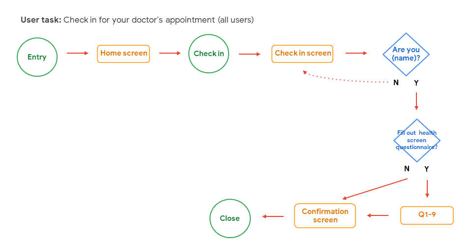
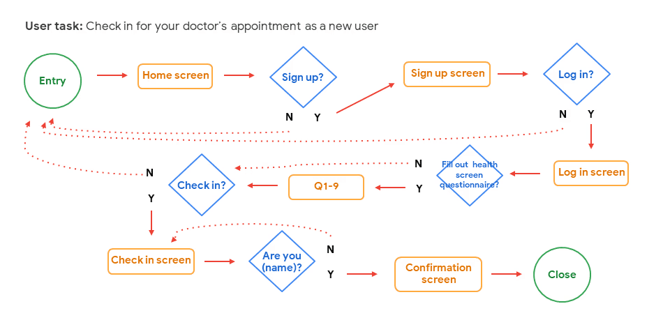
Redesign the User Flow
I streamlined the user flow by prioritising check-in as MyGP’s core function, followed by an optional health questionnaire to improve clinic efficiency.
Minimize Emphasis on Doctor Profiles
This feature was removed as it was unnecessary and caused confusion.
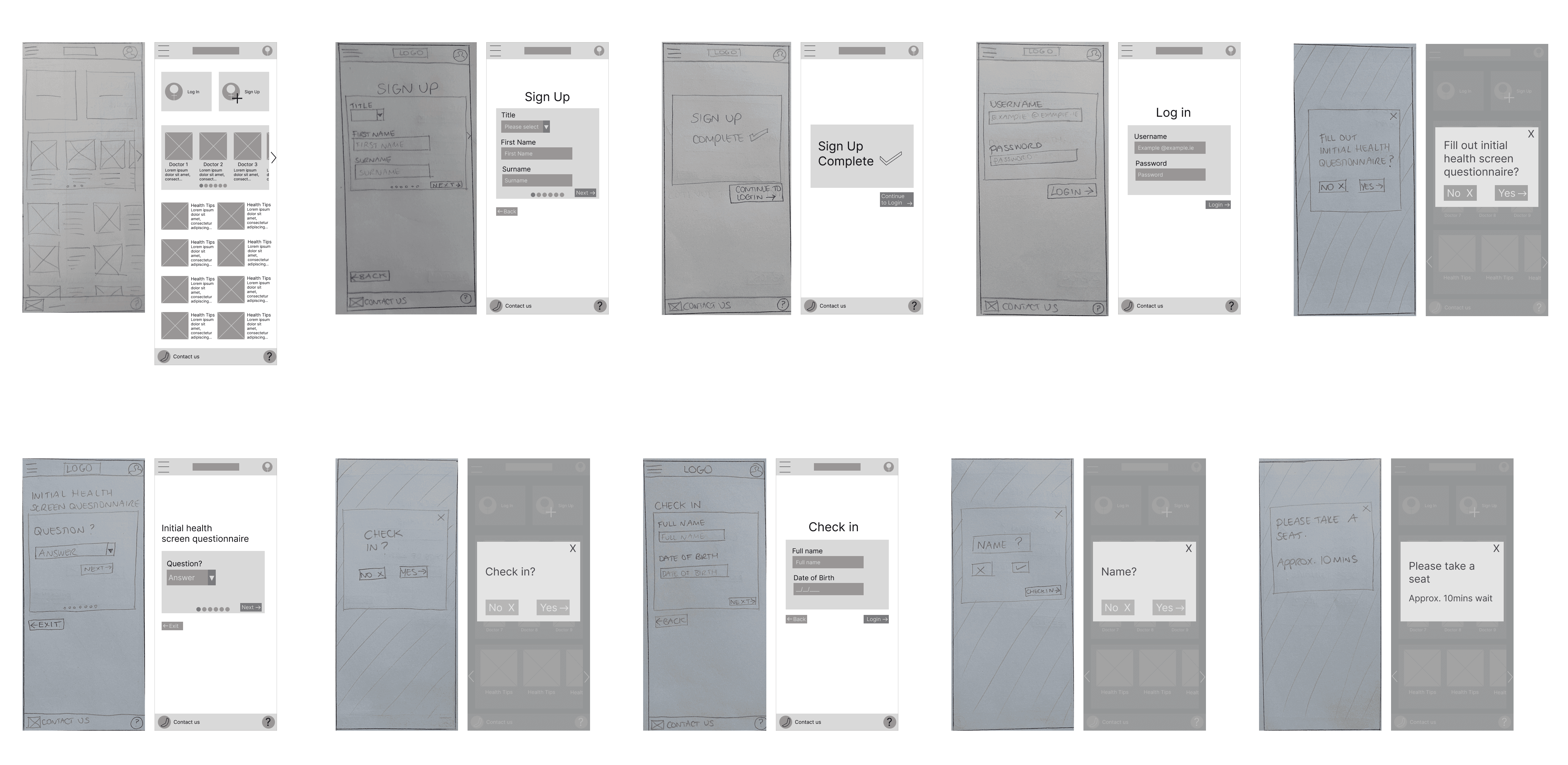
Check-in Without Creating an Account
The user does not have to make an account in order to check-in. They simply select ‘Check-in’ on the homepage and follow the instructions.
Clarify the Purpose of Health Tip Articles
This feature was also removed because it was non-essential and contributed to clutter in the design.
Research
Ideation
Design
Test
Outcome
Research
Ideation
Design
Test
Outcome
MyGP allows users to check in to their doctor's office, with a focus on supporting those who need assistive technology to check in independently. We will measure effectiveness by generating a daily user report.
Goal Statement

If Mary can navigate the check-in app/website on her own using assistive technology, then she will be able to visit the doctor’s office independently.
Hypothesis Statement

If Omar can complete the check-in process on his own, then he won't need to depend on others for assistance.
The goal of this phase was to define hypothesis statements, based on the problem statements. Next, I determined a value proposition and a goal statement. I then conducted a competitive audit. Finally, I constructed the user flow.
Ideation
If Alice answers the health screening questions every time she goes to the doctor, then she will be able to keep on top of her health.

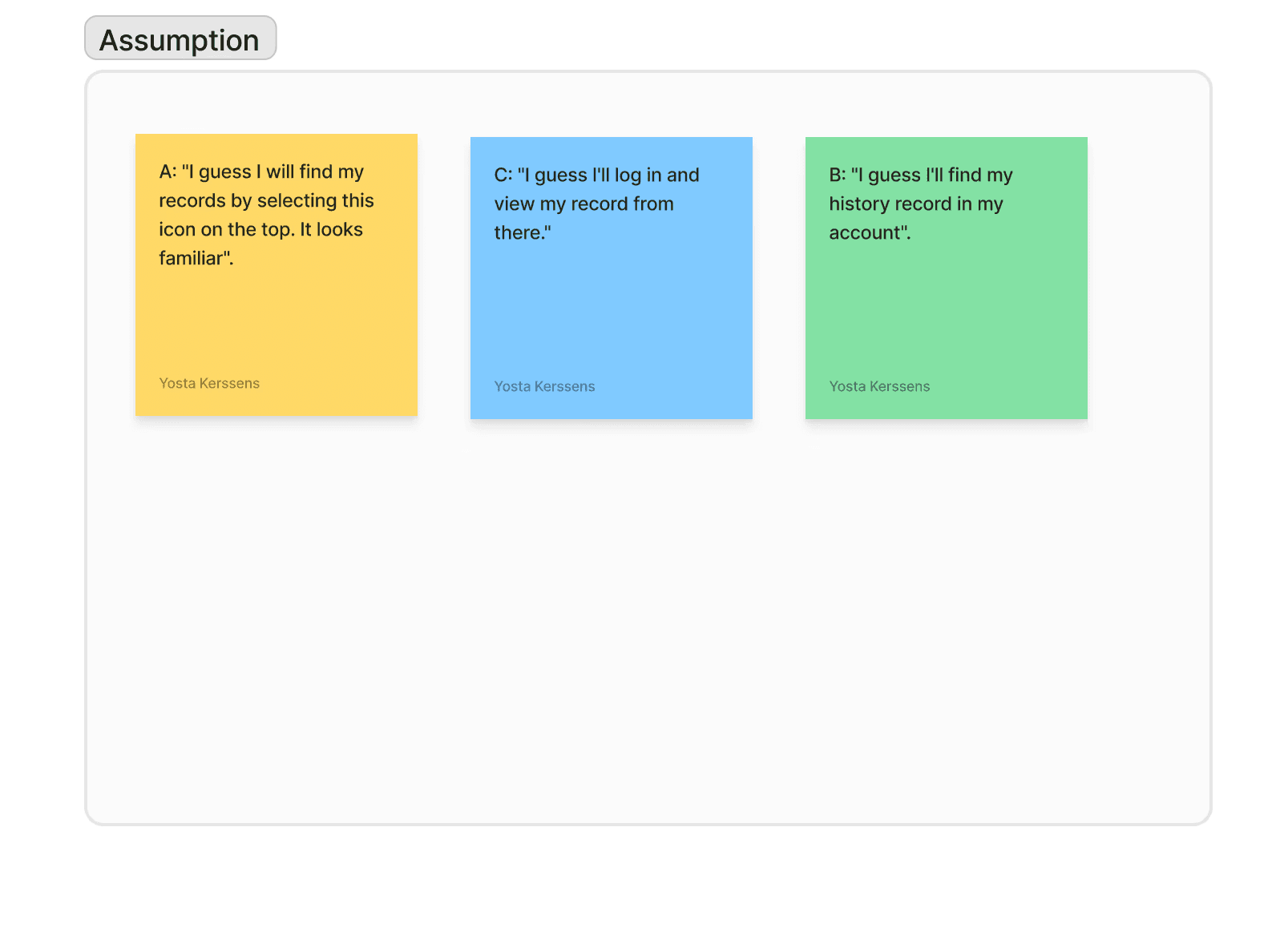
The moderated usability test with the low-fi prototype revealed a confusing and clunky user flow. Participants were particularly puzzled by the terminology, such as "Log In" and "Sign Up."
"I don't understand why I would have an account, I only want to check-in?"
After carrying out the moderated usability test, it became apparent that the user flow was full of friction and needed to be simplified.
"Where is the check in button?"
Having identified the pain points while observing user engagement, I gained a deeper understanding of how users interact with the check-in process, what frustrates them and where the user flow can be simplified. This led to the creation of a more efficient and intuitive experience for the user.
User Flow

Patients face challenges with unclear check-in processes, lack of accessibility and limited digital literacy when using their doctor’s office system. This leads to frustration, delays and missed opportunities for regular health screenings, which can delay the detection of potential health issues. Additionally, patients with varying levels of accessibility needs may face challenges in independently managing their check-ins, compromising both convenience and care.
Patients face challenges with unclear check-in processes, lack of accessibility and limited digital literacy when using their doctor’s office system. This leads to frustration, delays and missed opportunities for regular health screenings, which can delay the detection of potential health issues. Additionally, patients with varying levels of accessibility needs may face challenges in independently managing their check-ins, compromising both convenience and care.
Problem
MyGP provides an accessible, easy-to-use platform for patients to check in independently. It includes a clear check-in process, an integrated health screening questionnaire, assistive features for accessibility and options to amend answers, ensuring a seamless experience for users of all abilities and digital literacy levels. It enhances operational efficiency for doctors' offices.
MyGP provides an accessible, easy-to-use platform for patients to check in independently. It includes a clear check-in process, an integrated health screening questionnaire, assistive features for accessibility and options to amend answers, ensuring a seamless experience for users of all abilities and digital literacy levels. It enhances operational efficiency for doctors' offices.
Solution
Research
Ideation
Design
Test
Outcome
Research
Ideation
Design
Test
Outcome
Outcome
What I Learned
Conducting user interviews for the first time revealed the value of open-ended questions in uncovering unique perspectives and avoiding confirmation bias. Accessibility remained a key focus, with designs optimised for visual impairments and limited mobility. This project offered hands-on experience across the full UX process—from research to refinement—while mentorship and user feedback strengthened my understanding of empathetic, user-first design and deepened my passion for creating meaningful digital experiences.
What's Next?
To further develop this product, I would design a booking platform to allow users to book, reschedule or cancel appointments directly through the app.
Allow users to create personalized profiles with medical history, preferences and appointment reminders.
Incorporate advanced accessibility features such as text resizing and high-contrast modes.
Develop real-time wait time tracking. This could reduce frustration and allow patients to plan their time more effectively.

User Research
User Flows
Wireframes
Usability Studies
Low/Hi-Fi Prototypes
Mockup
Tools
My Role
UX Research
UX Design
UI Design
Branding
Timeline
Process
Figma
FigJam
Photoshop
Microsoft Office
Typeform
Capstone project in Google UX course
7 months
Research
Ideation
Design
Test
Outcome
Research
The objective of this phase was to generate empathy maps, based on my user interviews. Next, I created user personas and crafted user stories for them. I then produced user journey maps for each persona.
User Profiles & Problem Statements


User Journey Maps
“I like being self-sufficient and I don’t want my disability to hold me back”
Research
Ideation
Design
Test
Outcome
Goal Statement
MyGP allows users to check in to their doctor's office, with a focus on supporting those who need assistive technology to check in independently. We will measure effectiveness by generating a daily user report.
User Flow
Hypothesis Statement
The goal of this phase was to define hypothesis statements, based on the problem statements. Next, I determined a value proposition and a goal statement. I then conducted a competitive audit. Finally, I constructed the user flow.
Ideation
If Alice answers the health screening questions every time she goes to the doctor, then she will be able to keep on top of her health.
If Mary can navigate the check-in app/website on her own using assistive technology, then she will be able to visit the doctor’s office independently.
If Omar can complete the check-in process on his own, then he won't need to depend on others for assistance.
The moderated usability test with the low-fi prototype revealed a confusing and clunky user flow. Participants were particularly puzzled by the terminology, such as "Log In" and "Sign Up."
"I don't understand why I would have an account, I only want to check-in?"
After carrying out the moderated usability test, it became apparent that the user flow was full of friction and needed to be simplified.
"Where is the check in button?"
Having identified the pain points while observing user engagement, I gained a deeper understanding of how users interact with the check-in process, what frustrates them and where the user flow can be simplified. This led to the creation of a more efficient and intuitive experience for the user.
Research
Ideation
Design
Test
Outcome
First, I constructed the Site Map. Following that, I designed Storyboards and created Wireframes. Next, I modified my designs based on the Insights I gathered from a Moderated Usability Test I had conducted. I then worked on the Branding and crafted the User Interface, while also implementing Accessibility standards. I subsequently created a Mockup and carried out another Usability Test, before wrapping up with the Hi-Fi Prototype.
Design
Site Map

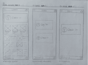
I simplified the site map after carrying out a moderated usability test.
Home Screen Development
1st iteration - Home screen
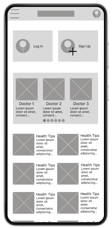
Design before usability testing - The interface was too cluttered.
There was too much friction with the check-in process, which is the core function of the app.
Design after usability testing - Simplified further.
Profile icon confusing, removed the doubt.

2nd iteration - Home screen
Branding
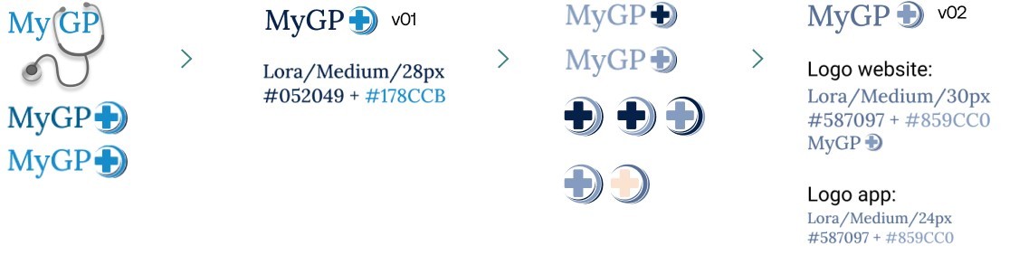
Logo design development
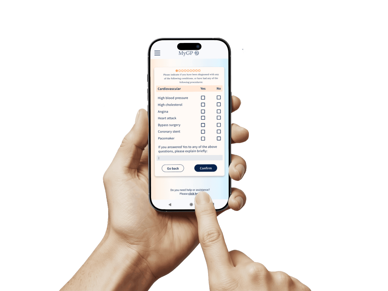
Health Screen Questionnaire
Accessibility
To meet accessibility standards, I used A11y Colour Contrast Checker plug-in in Figma to measure contrast ratio of text against background colours. The minimum contrast ratio for text is at least 4:5:1, following AA compliance level and 7:1 following AAA compliance level.

Typeform screen
MyGP app screen
Check-in Screen


Before - First iteration
After - Updated look + feel
Initially, I used Typeform to create the health screen questionnaire, but I wasn't satisfied with the layout. While it supported open-ended questions, I found it inefficient in terms of space, and I wanted to avoid making the form too long. As a result, I designed my own form with a tick-the-box format to make it easier for users. There is also space for the user to provide additional details if needed. This approach helps streamline the process while allowing for more specific input when necessary.
Orange is commonly used as a warning colour
The background image felt too clinical + unfriendly
Added a friendly tone with a welcome message
Replaced the help button in the bottom bar with a hyperlink
UI changes made
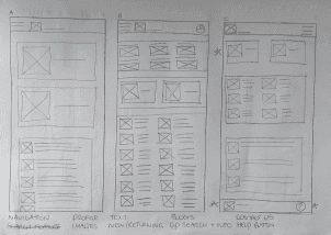
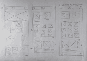
Wireframes
Paper + digital wireframes for all screens before usability test.


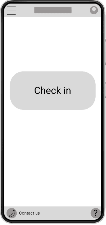
3rd iteration - Home screen
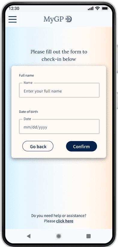
I applied inclusive design principles by using a 'full name' field, which respects individual differences and simplifies the process, creating a more accessible, user-friendly and inclusive experience.


Research
Ideation
Design
Test
Outcome
I conducted a Moderated Usability Test. Users provided feedback using the System Usability Scale.
Test
Affinity Diagram of Aggregated Findings from Moderated Usability Test
“I don't want to stand around and take ages to check-in.”
Actionable Insights Implemented from Usability Testing
Measuring Effectiveness
In addition to generating daily user reports, I would assess long-term effectiveness by tracking the app’s performance over weeks or months. This would include evaluating its impact on clinic operations, such as reduced wait times and lower administrative burdens. I would also define key performance indicators (KPIs), including user satisfaction (via surveys), adoption and retention rates, and the time taken to complete check-in.


Simplify the Check-in Process
I refined the home page by featuring just a check-in button and a welcoming greeting, creating a more relaxed and user-friendly experience.
Incorporate Icons for Better Usability
Icons were unnecessary in this design, as the process is straightforward and doesn’t require additional visual cues.
Redesign the User Flow
I streamlined the user flow by prioritising check-in as MyGP’s core function, followed by an optional health questionnaire to improve clinic efficiency.
Check-in Without Creating an Account
The user does not have to make an account in order to check-in. They simply select ‘Check-in’ on the homepage and follow the instructions.
Minimize Emphasis on Doctor Profiles
This feature was removed as it was unnecessary and caused confusion.
Clarify the Purpose of Health Tip Articles
This feature was also removed because it was non-essential and contributed to clutter in the design.

Research
Ideation
Design
Test
Outcome
Outcome
What I Learned
Conducting user interviews for the first time revealed the value of open-ended questions in uncovering unique perspectives and avoiding confirmation bias. Accessibility remained a key focus, with designs optimised for visual impairments and limited mobility. This project offered hands-on experience across the full UX process—from research to refinement—while mentorship and user feedback strengthened my understanding of empathetic, user-first design and deepened my passion for creating meaningful digital experiences.
What's Next?
To further develop this product, I would design a booking platform to allow users to book, reschedule or cancel appointments directly through the app.
Allow users to create personalized profiles with medical history, preferences and appointment reminders.
Incorporate advanced accessibility features such as text resizing and high-contrast modes.
Develop real-time wait time tracking. This could reduce frustration and allow patients to plan their time more effectively.
© Yosta Kerssens 2025 | Designer | yosta.kerssens210@gmail.com
See more of my work:
RecycleBuddy
Responsive App

Spotify
New Added Feature

© Yosta Kerssens 2025 | Designer | yosta.kerssens210@gmail.com
© Yosta Kerssens 2025 | Designer
User Research
User Flows
Wireframes
Usability Studies
Low/Hi-Fi Prototypes
Mockup
Tools
My Role
UX Research
UX Design
UI Design
Branding
Timeline
Process
Figma
FigJam
Photoshop
Microsoft Office
Typeform
Capstone project in Google UX course
7 months
“I like being self-sufficient and I don’t want my disability to hold me back”
User Profiles & Problem Statements
Research
Ideation
Design
Test
Outcome
Research
Ideation
Design
Test
Outcome
Research
The objective of this phase was to generate empathy maps, based on my user interviews. Next, I created user personas and crafted user stories for them. I then produced user journey maps for each persona.
User Journey Maps
Home Screen Development
Paper + digital wireframes for all screens before usability test.
Wireframes
I simplified the site map after carrying out a moderated usability test.
Site Map
After - Updated look + feel
UI changes made
Orange is commonly used as a warning colour
The background image felt too clinical + unfriendly
Added a friendly tone with a welcome message
Replaced the help button in the bottom bar with a hyperlink
To meet accessibility standards, I used A11y Colour Contrast Checker plug-in in Figma to measure contrast ratio of text against background colours. The minimum contrast ratio for text is at least 4:5:1, following AA compliance level and 7:1 following AAA compliance level.
Accessibility
Design after usability testing - Simplified further.
Profile icon confusing, removed the doubt.
Design before usability testing - The interface was too cluttered. There was too much friction with the check-in process, which is the core function of the app.
Research
Ideation
Design
Test
Outcome
Research
Ideation
Design
Test
Outcome
Branding
Logo design development

Health Screen Questionnaire
Initially, I used Typeform to create the health screen questionnaire, but I wasn't satisfied with the layout. While it supported open-ended questions, I found it inefficient in terms of space, and I wanted to avoid making the form too long. As a result, I designed my own form with a tick-the-box format to make it easier for users. There is also space for the user to provide additional details if needed. This approach helps streamline the process while allowing for more specific input when necessary.
Typeform screen
MyGP app screen
Check-in Screen
Before - First iteration
3rd iteration - Home screen

First, I constructed the Site Map. Following that, I designed Storyboards and created Wireframes. Next, I modified my designs based on the Insights I gathered from a Moderated Usability Test I had conducted. I then worked on the Branding and crafted the User Interface, while also implementing Accessibility standards. I subsequently created a Mockup and carried out another Usability Test, before wrapping up with the Hi-Fi Prototype.
Design
I applied inclusive design principles by using a 'full name' field, which respects individual differences and simplifies the process, creating a more accessible, user-friendly and inclusive experience.